Emote
A timeline of emotions
Course: Advance mobile design
Role: UX/UI Designer
Responsibilities: Research, UX Design, Prototyping, Illustration
Team: Eric and Amanda
Year: 2020
Overview
Emote is a mobile app that serves as an emotional directory, enabling users to track, reflect, and share their emotions. It allows users to upload content, add descriptions, and share with friends or mental health professionals.
The app provides monthly and annual analytics to help users understand their emotional patterns over time.
Research
Going into this project, my teammate and I didn’t have an immediate “problem” in mind that we were trying to solve, so we started to reflect on our own experiences. As seniors, we were thinking back on our time as college students. The feeling of anxiety and reminiscence were certainly present. With that in mind, we started exploring the topic of emotions. Keeping an open mind allowed us to explore different themes in our interviews.
What do people do when they’re feeling anxious or [think of an emotion]? What does journaling look like for individuals? What working for them? How often do they look back at their entries?
Interview highlights →
It would be nice to have something to refer back to at least once or twice a week.
— Clara
It’s sad when I can’t remember past events and how I felt during those times.
— Jasper
When I’m stressed, it’s nice receiving advice from others; it makes me feel less alone.
— Kyle
Insights
1
There’s no efficient way to categorize and recall handwritten journal entries
2
It’s hard to reflect on events and changes that you don’t notice or can’t remember
3
People wish to share their thoughts, but there’s minimal control over how to share with groups privately
Story board, task analysis, wireframes, and additional feedback
Questions collected
What if users have more than one feeling?
Could this app be beneficial for psychologists? Therapy?
Are there any visuals and animations that could make the experience delightful?
Branding
↓
Branding ↓
Moodboard
Neutral — content-oriented — clean
Expressive — calm colors — illustrative
Illustrations
Brush definition
(Body)
Charcoal feather
Stroke weight
(Body and face)
Set to 1px. For tablet users, check settings so the pressure does not change the weight.
Brush definition
(Face)
Touch calligraphy brush
Color
(Body)
Pastel and muted
Final mockups
↓
Final mockups ↓
Home feed
The home page consists of posts and comments from close friends. By default, the emotion that appears first when users open the application is the one that was tagged in the latest post.
To change the view, users can click on the arrow to open the navigation wheel. Swiping up and down will turn the wheel.
Profile
The profile page includes notifications, a chart with statistics on emotion entries, and account settings.
Posting
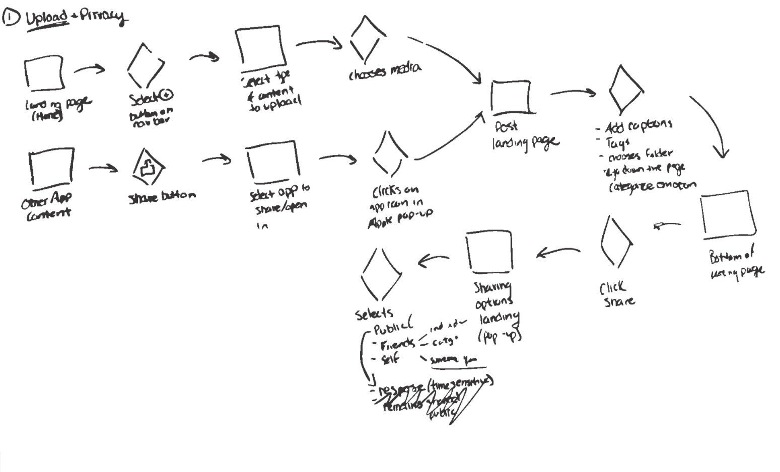
The app supports various media types, including photos, links, audio, and PDFs. Tagging an emotion is required, but adding a caption is optional. Once posted, comments from friends are welcomed!
All internal notes and comments received from friends are private.
Statistics
View by month and year.


